

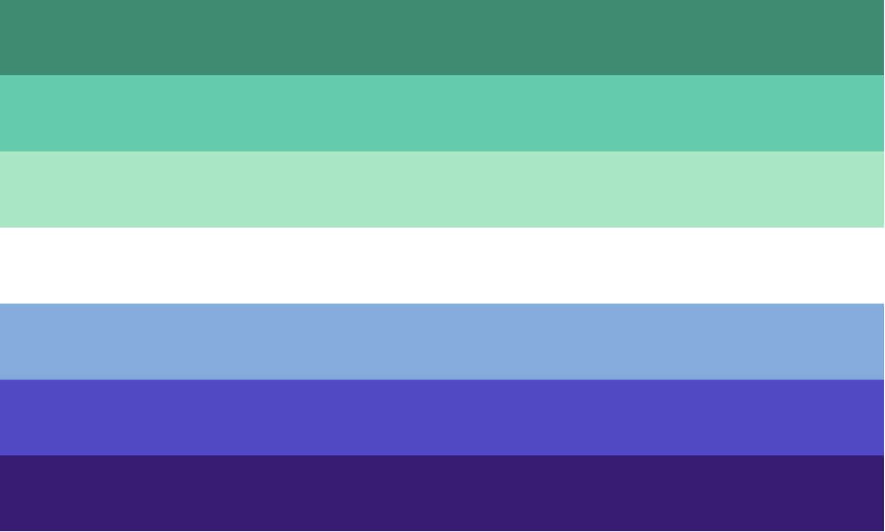
I love this flag so much. A lavender and a royal blue that isn’t hideous to look at. Here’s the lore: there used to be the “biangles” or the bisexuality triangle by Liz Nania which was designed as a protest symbol. It was created by taking the pink triangle that denoted gay men during the holocaust and partially overlapped it with a blue triangle.
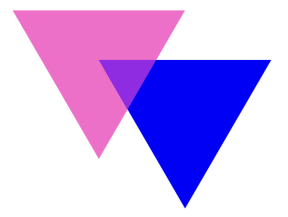
The pink represents homosexuality, the blue represents heterosexuality, and the lavender represented the “queerness of bisexuality,” but nowadays people see it as just general attraction to people regardless of gender.
Getting back to why I love this flag, not only are the colors beautiful, but also because the history behind the flag is very interesting. Also, there is a reason why bisexual lighting exists and is visually appealing but non-binary lighting would give you eye strain.
My only nitpick about this flag is that, because of the new interpretation of the middle lavender portion, it makes it seem as if non-binary people and relationships that cannot be defined as strictly heterosexual or homosexual are lesser than or not as important as the strict gay or straight relationships. This is because the mid-section takes up only one-fifth of the flag compared to the two-fifths the other colors take up each.
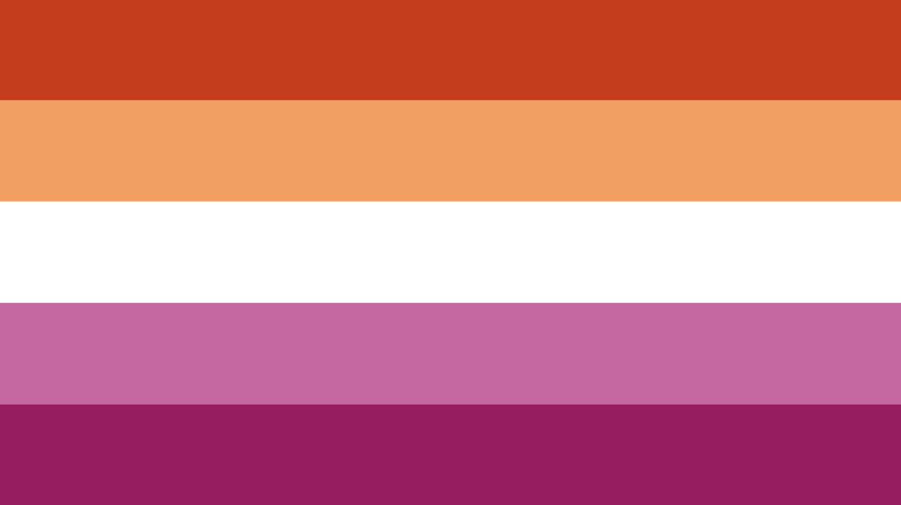
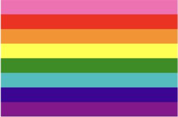
Through only five colors, the picturesque view of a beautiful beach sunset is represented through the lesbian pride flag. Is the flag actually supposed to represent a sunset? No, probably not. But it sure does look amazing. However, there is less meaning left in the flag because the original orange-pink version had two extra colors that both had meaning to them that were removed when being converted to the standard five stripe template.
Unlike the bisexual flag which has had one main flag throughout the years, the lesbian flag has gone through many iterations. These include: the Labrys lesbian flag; which used a black triangle that represented lesbians during the Holocaust (similar to the pink triangle that represented gay men) and a double-sided ax in the middle, the Lipstick lesbian flag; which ceased to be used due to controversies surrounding the creator and their intentions on making the flag, and finally the one used today shown above which seems it will stand the test of time.
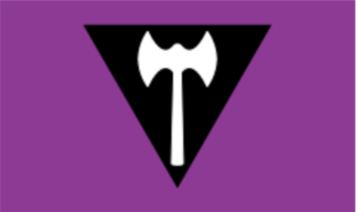
Before I go onto the next one, I need to say that the Labrys flag would be very high on my list if I was ranking past iterations of flags. There would be too many for me to rank if I did rank all of the past pride flags, but maybe I will in the future just so that I could admire the creativity of the lesbian community throughout the years.
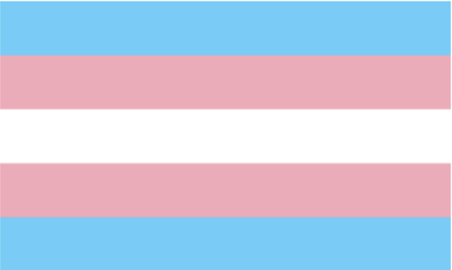
Simple, plain, self-explanatory meaning. What more could you ask for? While this flag is extremely iconic and more noticeable than most of the other flags on this list, unfortunately, it just doesn’t look AS good. Because trust me, it still looks better than most other flags.
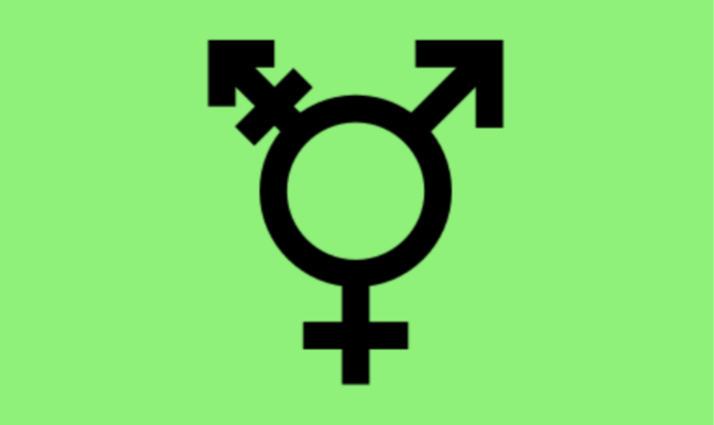
I also fancy the trans-symbol as well. As far as I can tell, there isn’t an official name for this symbol, but it looks badass so that’s what matters. I definitely see this getting tattooed on people because it looks like an underground rave scene group symbol from something of the likes of “Cyberpunk 2077.” If you didn’t tell me what this meant I would definitely get a poster of it just because of how cool it looks.
The color they chose for the baby blue and the pink are very nice and the white gives a nice balance as well. Just like the two homosexual flags, whenever I see this flag it reminds me of a scene in nature. But this time it makes me think of a blue shark with pink gums and white teeth, obviously due to the Blåhaj, the IKEA shark. The shark became a symbol of transness due to it bearing the colors of the trans flag and IKEA using the toy when doing anything LGBT related.
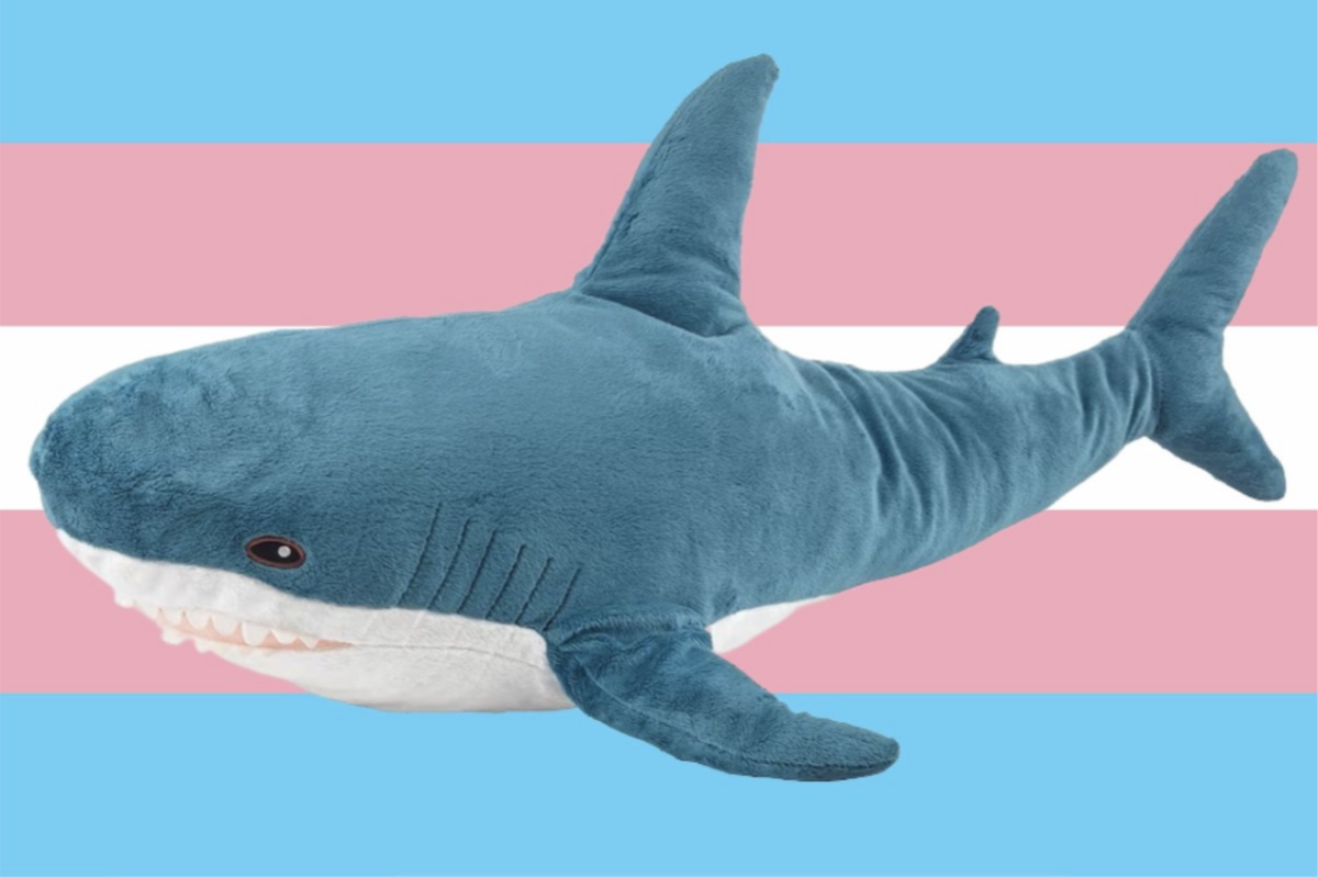
Saying that the cute shark (pictured above with a trans flag background) did not sway my opinion into putting the transgender flag higher up onto the list would be a lie.
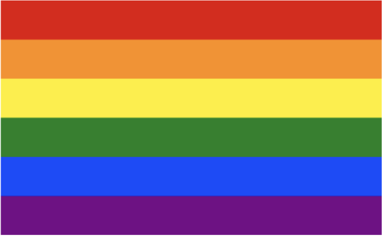
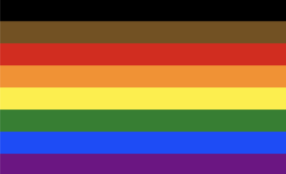
The flag that started it all. One of two pride flags to get their own emoji too! The creator was inspired by many different things and also had his own list of questionable meanings for each of the different colors. I mean, magic (one of the meanings)? Really? Are all gay people really mystical witches and wizards?
Until making this list I didn’t know that two of the colors had been removed. The original had eight different colors and had a hot pink stripe on top as well as two different colors for blue.
The funniest part of it all is that the pink was removed because finding fabric in such color was hard to find. Which, quick sidetrack, is why many countries’ flags today do not have purple in them; purple dye was either expensive or just non-existent in their region. I could not find a reason why the two shades of blue were conjoined into one but I am glad because it looks much better that way.
As for the looks of the flag? It looks good, there isn’t much symbolism to the flag which is probably for the better. Having a flag that represents a whole community is better off being interpreted in various ways, rather than having a set one-size-fits-all definition.
It is nice to look at and doesn’t hurt the eyes but at the same time, it also isn’t anything crazy. I like it. Nothing special but this is for the better. Because as the list gets lower and lower you will also start wondering how any of these flags got approved because man, they look awful.
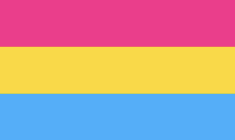
Literally made by some random Tumblr user. Man, imagine historians having to go through long Tumblr threads in the future to discover the coveted queer lore. Although I like how it looks more than the original rainbow, the flag was made to distinguish pansexual people from bisexual people, yet it really just contributes to the conflating of the two sexualities.
Both the bisexual flag and the pansexual flag have girl color on top and boy color on bottom with a different color representing the in-betweeners of gender that pansexual people also like. So, if this list was based on purely looks, I would have put it higher because it is nicer to look at than the rainbow flag for sure but the meaning behind it ruins it for me.
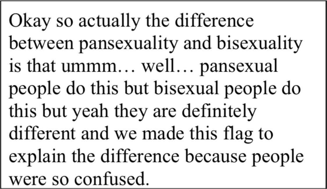
I still don’t really know the practical difference between bisexuality and pansexuality and the flags being so similar doesn’t really help. In my opinion, if I could redesign the flag I would just make it this:
Alright. Going to be honest here guys. I think this flag looks like the inside of my toilet after Taco Bell. Hey, at least it is unique right? But no. I wish they (get it?) would’ve just done a more cookie cutter approach because man this looks awful.
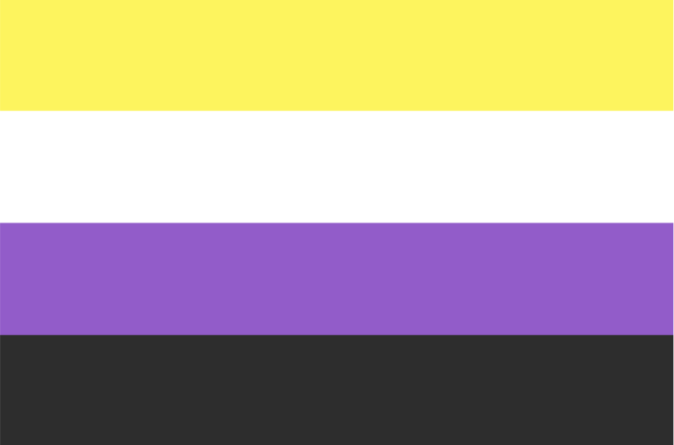
Does the meaning behind this flag help it out at all? Sort of. All of the colors represent the different ways of being an enby. But to be honest, I cannot get over the colors no matter the meaning.
Although I do not like the flag, for the most part, the non-binary community seems to like it. Which is good because obviously I am not the target demographic so my opinion doesn’t matter. How do I know that they (this will always be funny) like this? Because I know multiple they/them users that proudly display this flag whether it be through patches or phone lock screens.
The reason why this is significant is because I almost never see gays, lesbians, bisexuals, pansexuals, etc. doing the same. The only group that promotes their flag just as much as non-binary people are trans people. But what do I know? Maybe if I get on HRT to become an enby the estrogen will make me fall in love with the ugly yellow and lavender.
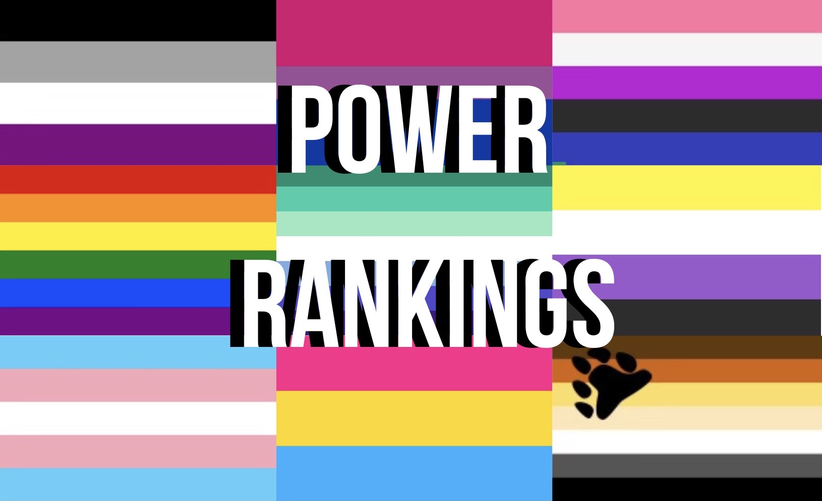
Honorable mentions:
These aren’t necessarily in this spot of the list, though some are, but I wanted to cover some lesser known pride flags quickly because most of them I do not have as much to say about them. For these, I won’t rank them because I need to finish this article up as it is getting long and because I choose not to dwell on flags that aren’t significant for most people. I mean, find me one person that uses the twink flag (and yes, this is a real flag).
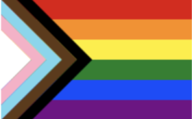
You might be wondering, “What is wrong with this flag?” especially because it is the most popular pride flag there is. Well, the reason why I hate this flag is why I decided to make this list in the first place. Not only does it look awful and destroys the beauty of the original, but also, the meaning behind it is something that only a liberal could think of.
First of all, the design. Just look at it. You too can tell how bad it looks just by looking at it. The black and brown are ugly and clash with the cute and calming trans colors. If I could, I would replace every version of this flag with the original version because I seriously hate it that much.
My hatred for this flag is ever increasing every time I see it in one of my teacher’s classrooms (shoutout Mr. Love). I appreciate the sentiment, and I think that anyone who has a pride flag in their classroom is extremely brave and caring for putting their money where their mouth is and truly showing their support for students. But man, it sucks to look at it. I won’t go into more detail about it because I hate even thinking about how badly I hate how this flag looks but also because, well, I care about you, the reader, and don’t want to make you throw up.
So not only do I hate the design, but even more importantly the message is awful too. First, why is there a trans flag layered on top of the regular rainbow flag? The rainbow flag has come to represent the entire LGBTQ+ community, not just gay people, so why is there an included part for just trans people? It makes it seem like transgender people are different from other queer people which is exactly what the original was trying NOT to do.
Okay fine. I know it was just added because trans people are currently being systematically discriminated against right now, especially in the United States. Although, wouldn’t it just be better to just fly trans flags then? I digress.
The idea of including people of color is good because they are similarly discriminated against like the LGBTQ+ community is. I have respect for the Philadelphia version of the flag because of this as well as because they implemented it into the original flag incredibly well.
The problem for me, though, is that it conflates the two issues and makes it seem like people of color’s struggles are the same as, or worse, equal to, queer people’s struggles. The Philadelphia flag, however, didn’t do this because they were trying to showcase the people of color queer people, not saying, “We support people of color, transgender people, and everyone else,” which equivocates these very different issues. And yes, I know everyone is similarly discriminated against under capitalism and that we all have a common enemy, but that’s not what I am talking about.
Why is this a problem? Because liberals, in particular queer ones, often think that because they support one group means that supporting the other group in the same way is acceptable.
To explain in a better way, suppose you had a death in the family and struggled on tests for the next week because of it. You understood the content perfectly well and studied harder than anyone else in the class, but emotionally, you couldn’t handle it. Would you like it if your teacher saw that you were struggling, and instead of asking what happened, they just gave you the study materials someone else used to succeed. Not knowing that you didn’t need help understanding the content, you just were dealing with personal struggles.
I bet you would be pretty annoyed. And if so, then you can understand why I do not like putting people of color’s struggles on the same flag representing queer people’s struggles. It doesn’t matter whose challenges are greater; what matters is that they are different, so if a flag conflates them, then the flag is something I am against.
Hopefully, through my rant, you can see that although most of this list was lighthearted and fun to make, I am genuinely passionate about my hatred for the progress pride flag. Anyways, I hope all you transgenders enjoyed your day of visibility, and I would like to personally thank the queer community at Prospect for letting me make an over three-thousand word essay on literal pixels on a screen.
But wait, I’m not done, now you might be wondering what I think are some good design philosophies to use to make future pride flags. In the future, I hope I can design some random pride flag for some random sexuality or random gender expression because why wouldn’t I? If I could make someone have a better life because I created an avenue to express themselves better, I would. And you could too! Here is how you could make a good pride flag that could get you written down in the history books.
- Make it filled with colors that go well together.
This is number one because it is the most important, and it is what you should do first when designing a flag. If you take the average queer person, and make them pick between two different flags to represent their identity, they will always pick the one that looks better. So make it look good. For inspiration, make the opposite of the polyamorous flag.
- Make the meaning obvious.
If a five-year-old cannot figure out what you are trying to express with the flag; you have failed. That doesn’t mean the flag has to be simple, just a meaning that is communicable. There is a difference.
- Don’t put your opinions into the flag.
Don’t be like the lipstick lesbian flag and have people stop using you because of your opinions about the sexuality that were reflected on the flag. Make something that is universal and anyone can feel confident using.
- Be original, but not too original.
Be like the Bear flag, but not polyamorous flag.
Did you agree with my picks? What would you change about it? Comment down below your opinions on pride flags. Hopefully, in the future, you too can design a pride flag. And hey, if you do, please give me credit for inspiration so I can prove to my parents and my advisor that the ten-plus hours I spent writing this was worth it. Please… I’m desperate… 🙁


Secret Admirer • Apr 1, 2024 at 1:42 pm
Nice article sir! You are very handsome!!!