FIVE MOVIES WITH PRAISEWORTHY CINEMATOGRAPHY
May 2, 2020
Cinematography is the art of making motion pictures and telling a story through a camera lens, bringing each visual detail of a movie together. Choices made about light, color and camera angles can often tell a story with no words spoken at all. Some feelings cannot be put into words, but with the right lens and creative mind, those feelings can be represented through visuals to tell a story. Here is a list of five movies with cinematography that caused me to find myself lost within each story told.
Emma. (2020) 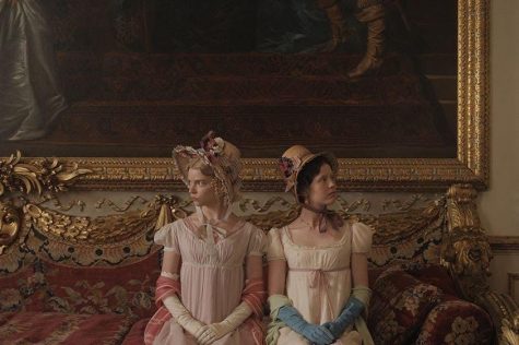
In “Emma.,” directed by Autumn De Wilde, cinematographer Chris Blauvelt captures every reaction a character does not want to be seen. Whether it is a heart beating faster than usual or a hidden smile, each emotion subtly hidden adds to the storyline and tells the viewer more about each character.
This really adds to the detail within the movie adaptation of Jane Austen’s novel. Blauvelt shows scenery, costumes and the set through his lens as if it were to remain untouched. The entire movie seems as if it has been polished with gold leaf itself.
Candlelights flutter inside at night embodying the liveliness of the main character’s heart. Still shots are used to show the elegant, prestigious lifestyle lived through luxury, whereas a lot of the shots with movement come in when characters walk instead of riding in a horse drawn carriage to show their freespirit.
The visual storytelling does not stop there — the costumes are extremely refined and truly admirable for their detail. Blauvelt’s cinematography both captures the lifestyle of a high status and what is hidden behind it all: real people.
Although the movie is pleasing to the eye and can be praised for its aesthetic beauty, the realness of the cinematography lies within the light and types of shots chosen to represent who the characters truly are behind fine china and hair coiled within tight spirals.
Call Me by Your Name (2017) 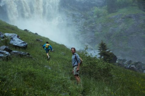
The story of the novel “Call Me by Your Name,” written by André Aciman, was shown through visuals when released as a movie adaptation in 2017, the same year it received the Oscar for Best Adapted Screenplay.
The movie’s director Luca Guadagnino and cinematographer Sayombhu Mukdeeprom worked together to bring Aciman’s story to life.
This job could not have been easy due to the fact that the main character of the novel and movie Elio Perlman often lives inside of his own mind and feels many different strong emotions including longing, love and loss.
Guadagnino had a vision of shooting the entire movie through one lens, which Mukdeeprom was completely on board with. Using a single 35mm lens, the thoughts and feelings which had previously remained in the mind of Aciman’s characters were now brought into the light with each detail of the movie.
Filming “Call Me by Your Name” with a single lens also created a film with simplicity that felt real and natural. Northern Italy’s magic is captured in the movie as if the viewer has booked a flight to the destination themself.
Mukdeeprom’s use of movement and camera angles to represent the character’s emotions does not go unnoticed as Elio Perlaman and his love interest Oliver run through the grass near Europe’s second tallest waterfall, Cascate del Serio, and explore the area. Movement is used to enhance a sense of adventure through the area.
Another one of Mukdeeprom’s strongest successes with cinematography in “Call Me by Your Name” was when he used light to represent Elio Perlman’s emotions. He is left with a mix of conflicting emotions at the movie’s end which is represented using shadows and light projecting onto his face from the nearby fire as the shadow and light compete with each other to show him reminiscing on the light brought into his life followed by heartbreak.
This movie is a must see for anyone who wants to take a trip to Northern Italy for two hours and 12 minutes.
Atonement (2007) 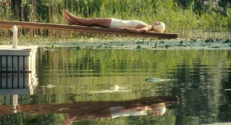
“Atonement,” another movie adaptation, is based on a British novel by Ian McEwan. Its director Joe Wright and cinematographer Seamus McGarvey work together to truly present the theme of different points of view on a situation throughout the movie. McGarvey does this by showing scenes of the movie for how they actually are versus how they seem from main character Briony Tallis’s eyes.
He includes a lot of light which could possibly represent the innocence within each of the main characters no matter how they may be perceived by the viewer.
For example, in one scene, Robbie Turner is warning Cecilia Tallis not to step on glass, but Briony sees this as Robbie simply screaming at Cecilia from her window. As the movie proceeds, the viewer is able not only to see every situation for how it actually ends up, but to see situations through Briony’s imagination both when she is young and old.
Light is also used to show the contrast of the moments which are lighthearted compared to the ones which show struggle. Darkness certainly follows Briony as she grows old and comes to the realization of what was truly happening within the situations she perceived.
After one event that makes “Atonement” take an extreme turn in plot, each shot is suddenly darker as each person deals with a struggle caused by Briony simply perceiving a situation from her eyes and misunderstanding it greatly.
Many of the cinematography’s details throughout the movie are admirable, such as the movement and color used to represent a heart beating as main character Briony runs with a letter Robbie wrote for Cecilia only to realize it is the wrong letter. After he realizes, the style of shots change, and everything is sped to a faster pace including Robbie’s own flashback of what happened.
Another amazing detail is the five minute single take tracking shot showing Robbie’s surroundings at the end of the war which took place in “Atonement.”
This movie beautifully represents how much a single event can change a person’s life through a lens using color beautifully and deserved its Oscars nomination for Best Cinematography.
Rear Window (1954) 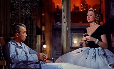
Ahead of its time, this mystery movie from the ‘50s “Rear Window” directed by Alfred Hitchcock includes cinematography done by Robert Birks that directs the viewer into the main character’s mind immediately.
Most of the movie is seen through the main character Jeff’s eyes, a photographer that peers out of his apartment window, finding entertainment as he observes each of his neighbor’s actions. Due to his injury, the cinematography is shown with a stopping point considering his vision can only go so far.
For example, the viewer does not see the neighbors up close unless Jeff uses binoculars. Even with binoculars, the parts of the wall which cover up rooms make it hard to see what the neighbors are doing at the times when Jeff seems to be the most curious. This makes the mystery of what the neighbor across the street is up to as unknown for the viewer as it is for the main character himself.
There is also a great use of lighting in this movie when the characters lurk back into the shadows when they do not want to be seen by others. Not to mention, the entire movie is filmed on a set which looks as if it truly is an apartment complex.
Nominated for the Best Cinematography Oscar in 1955, this movie stands out as it shows Jeff’s perception of others around him including main character Lisa Carol Fremont being perceived with a bright light, almost as if her presence is glowing.
The Grand Budapest Hotel (2014) 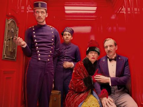
Wes Anderson’s movies are a looking glass into his mind, showing the originality and creativity he provides when filming each of them. Robert Yeoman, a reoccurring cinematographer in Anderson’s films, brings his ideas together through the lens of his camera as he uses symmetry, color and lighting to bring each story together.
“The Grand Budapest Hotel” received nine Oscar nominations, winning four, in 2015. The movie was nominated for Best Cinematography and won Best Production Design, Best Costume Design and Best Makeup and Hairstyling.
This is not much of a surprise considering that when the hilarious story behind the hotel is told through the lens of Yeoman’s camera, there is little time for the viewer to blink. The set design is unbelievable from start to finish and from outside to inside with its eye catching complexity and color variety.
A variety of light is also used to represent the hotel in the ‘30s versus the ‘60s. The hotel and characters in the ‘60s are shot in a darker light compared to the ‘30s, focusing on the hotel being less lively as time goes by — even though it has history within its walls.
There are two scenes in this movie that really stand out for their cinematography. In one scene, a jailbreak is shown as the camera follows the elaborate plan the characters have constructed. The perfectly straight camera follows the inmates as they do things like climb over and under the beds of sleeping guards.
In another scene, two main characters sled down an elaborate ski trail trying to catch up to another character. This scene is comedically incredible as the ski trail’s twists, turns and obstacles continue to stand out and overtop the previous ones.
There are not enough words to describe the praise “The Grand Budapest Hotel” deserves for its unique comedy represented through visuals.


