

As the years go by, things change. We wanted to see how Prospect sports jerseys have changed over the years. We compiled a list of the jerseys We thought changed the most starting in 1962 going all the way to the present day. We did not include jerseys from every sport or year because some of them looked the same each year so they did need comments. Both of us wrote out our opinions of what we thought so let’s hope some of these jerseys hit the score and let’s kick it off!
ALYSSA’S OPINIONS:
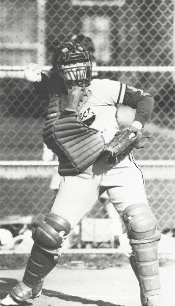
Baseball 1974
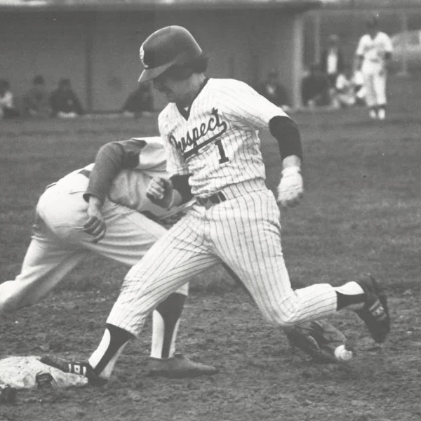
This uniform could be a lot worse. It’s kinda similar to the uniform right now too. The pants look kinda awkward at the bottom. They almost look like they roll up into the pants. It looks really weird. I also have to point out that the helmet looks like it protects nothing. The neckline on the jersey is pretty interesting too. The outline is just not it. I also have to point out the socks. They do not combine well with the pants. It does not look right at all and the pants do not help at all. Overall it definitely could be better but I guess it makes sense for the time period.
Baseball 2024
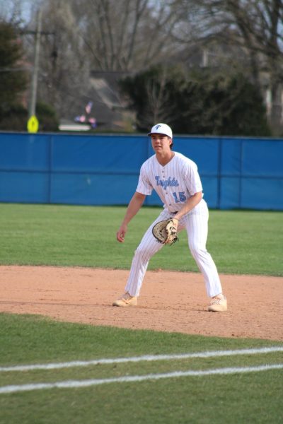
This uniform looks a lot better. Personally, I like the pinstripe. The only thing is that whenever they slide, you can tell. There is going to be a dirt stain for a while. Otherwise I really like it. The hat is a good add-on too. For softball we have visors and they really come in handy sometimes (the sun can be brutal). The white uniform works with so many undershirts too. Even if it’s hot outside, it doesn’t look like you would overheat or anything. Overall, the uniform is pretty good. A big step up from the 1974 baseball uniform.
Girls Water Polo 2009
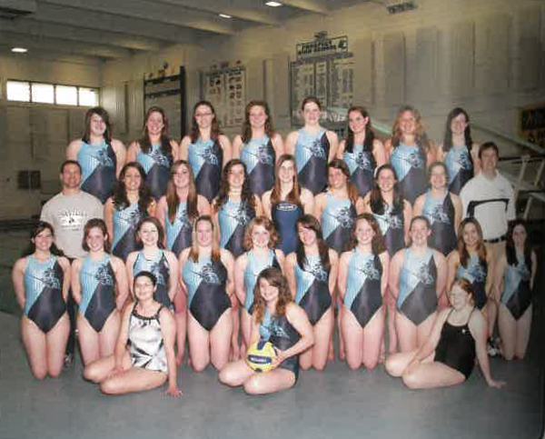
This uniform is interesting. I am not a fan of the line in the middle. Also what is the logo at the top of it. Does not look like a knight at all. I can’t even see what it is. The colombia looks like it would just blend into the water. And the colombia doesn’t even look like colombia. This one is definitely not my favorite. I guess it worked for 2009, but in my opinion it does not work now.
Girls Water Polo 2024
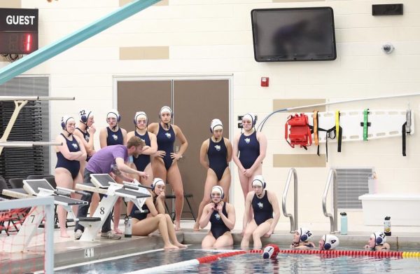
This looks so much better. In some ways this uniform almost looks more modern. The navy looks so much better then whatever was in 2009. The diagonal with the colors was just not it. In some ways it looks more comfortable too. I also like the logo. It isn’t just the knight, it has the water polo ball too.
Softball 1988
I know it is a little hard to see this uniform but it isn’t terrible. I wish it wasn’t black and white so I could see the colors. I might be a little biased since I play softball, but whatever. I like how the jersey and pants match. Some teams don’t do that, but this looks good. What is the undershirt though? It doesn’t look like it does anything helpful.
Softball 2023:
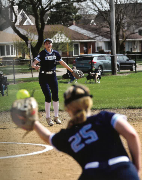
I like this one a lot. Like I said before, I might be a little biased since I play softball, but still. I like the navy a lot. They also have white jerseys but we don’t have a picture. I like the big block letters saying “knights”. It looks very put together. I also like the colombia stripe on the sleeves. Most of the time the sleeves are rolled up, but they still look really good. The navy also looks really good with everything. Doesn’t matter what color the mitt is or helmet or anything, it usually always looks good.
Boys Soccer 1997
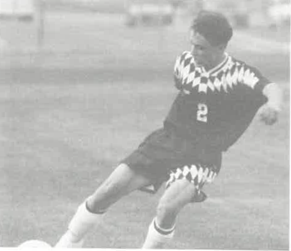
This jersey is interesting. The design at the top is something. It’s even on the shorts too. Are they triangles? I don’t even know. I’m not sure if I like it or not. I feel like this uniform definitely works for 1997 though. It’s not terrible but it definitely does not make the top 5. I have to add, the shirt seems so baggy or at least baggier than others. I want to know what colors they are. My guess is navy and white maybe since any other colors don’t make sense. Some of the other jerseys are definitely better than this one in my opinion.
Boys Soccer 2024
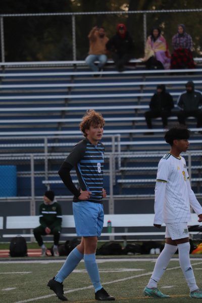
Okay, this jersey is a lot better. The stripes are definitely a pick. I’m not sure what else would be on the front. Otherwise the rest of it is fine. I like the blue and gray a lot. This jersey is definitely a step up from 1997. I said it before but this uniform is more modern too. It just looks better.
SARAH’S OPINIONS:
Cheer 1962
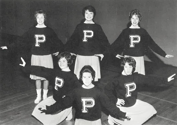
This uniform is honestly a little boring. I think for the time period it probably makes sense cause a lot of clothes were just solid colors but there’s nothing super eye-catching about this uniform. Also I think I need to talk about the skirt. As a former cheerleader myself, I know that it is a lot easier to jump, tumble and stunt when there’s not a long skirt in your way, so how these ladies in the ‘60s did it is questionable. The P on the front of the sweater is cute but I think they could have added the word Prospect on the front because just putting the letter P is a little bland and there’s a lot of schools that start with the letter P. Side note, I need to comment on the hair. Why do all the hairstyles make them look like grown women when they’re in high school? I’m so used to the over teased cheer ponytail that these business in the front party in the back hairstyles just feel wrong.
Cheer 2023
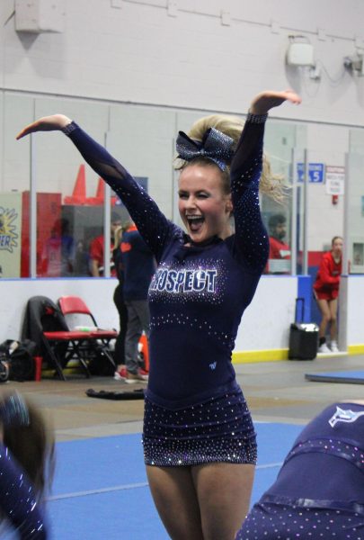
I love these uniforms. It might be because I am used to this style of long sleeve top and shorter skirt than 1962 but I think this style of uniform is much more sleek and it allows for more movement. I’m also a fan of glitter but I’m a sucker for sparkles. I think the choice to use a Navy blue for the uniform gave it a really cool look. It makes everyone look like a cohesive team. I have to give credit to 1962 cheer because they also had the same uniform but I wish the uniforms had some more personality like 2023 does. I also really like the cheer bow. I like the flashy big bow as opposed to ribbons which were what girls wore in their hair around the ‘90s. The last thing I would say about the cheer uniforms is that they look much lighter and breathable than the ‘60 which I appreciate.
Girls Volleyball 1974
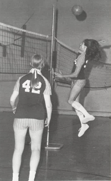
We need to address the pin stripes on the uniform. What’s going on here? It’s giving baseball meets old volleyball uniform meets new volleyball uniforms and I’m not sure how I feel about it. I wish I was able to know the color of the uniforms but I assume they are navy and Columbia blue which I think is cute in contrast to the pinstripes which I assume are white. Something I don’t love is the pinstripe shorts. It reminds me too much of baseball pants and I think they would look better as a solid color. Overall I like parts of the uniform like the top but the stripes are distracting and I think the ‘70s volleyball uniforms are questionable, as a lot of things were in the ‘70s.
Girls Volleyball 2023
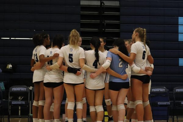
These uniforms are plain and simple which usually I like but to be honest, it’s boring. I like the little knights logo on the back but why not add something like the ‘70s. I’m not saying go full stripes but maybe a shiny outline on the number or something to make the top stand out. Also I think black shorts are a safe choice but to make it look better I would go with navy for that Prospect spirit. Also I admire the ribbons in the girls hair from 1974, so I think to make these ribbons pop more there could be some fun hair ribbons or something similar. I also think these jerseys are a little baggy so they could be a tighter shape or just smaller to allow for lots of movement. This jersey could use some more pizazz, but I like it.
Boys Basketball 1962
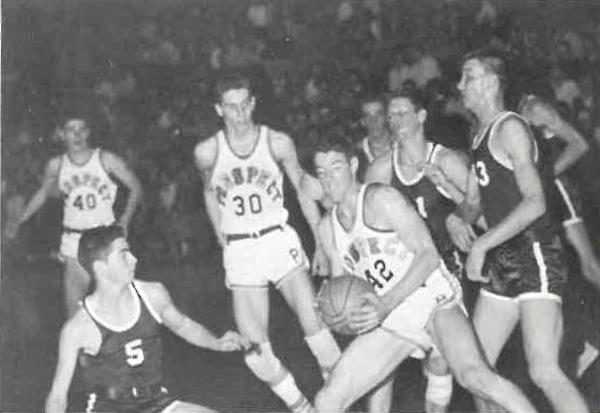
I was already expecting the short shorts but still, why so short? I expect this from cross country but I feel like for basketball shorts they should be a little longer considering they’re jumping up and down a lot. The jerseys look pretty similar to recent jerseys but I think the material is thinner, which might have just been the style for the time. I think the style of shorts could possibly be influenced by former NBA basketball player Larry Bird since he is known for his shorts so this makes sense. I don’t have much to say about this jersey since it’s pretty basic, but I like the style and it’s pretty similar to recent years.
Boys Basketball 2023
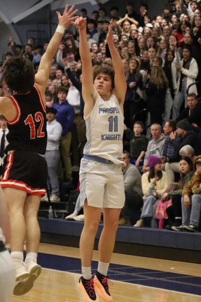
Ok, I must say the length of shorts is a lot better. I wish I could see the colors for 1962 but I can’t so let’s talk about the colors on the jersey for 2023. I like the pattern down the side that’s a light blue with what looks to be speckles of white. I think the Jersey in past years where it was all black and some blue stood out a lot more than this one because the colors are so light. There is nothing really to catch your eye. Something I liked from 1962 more than this is that the Jersey just said Prospect. I think Prospect Knights and the jersey number is just too much and it’s crowded. From this picture the jersey looks like it’s tucked in which might just be the style of it, but it looks a little weird being tucked in so maybe the jersey could be a little shorter. I like that the number is bold and easy to read, especially because the outline is black but there’s nothing too eye-catching about this jersey, and I like the previous years’ versions more.
Girls track 1988
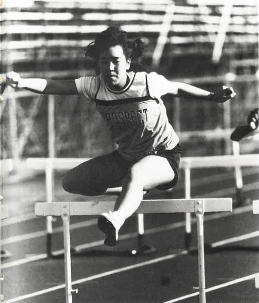
This jersey kind of looks similar to the ones worn in the present day but without the white part on top. I kind of really like this jersey but I can’t really figure out why. It just looks cool with the white t-shirt underneath and it’s not too baggy but not too tight. I think a tighter one could be used here because for track it’s easier to run without the jersey or anything getting in the way. I like the word Prospect all the way across and the material seems to be a good one. I do not really vibe with the shorts and as a former track athlete myself I usually liked spandex because it was easy to see the hip number without the shorts flailing around and I went over a hurdle and the spandex I wore were usually navy blue to go with my jersey. These shorts look black which isn’t bad but I just thought navy blue also went with the theme of Prospect. Overall, I like this jersey a lot but the shorts are not for me.
Girls Track 2023
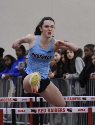
First of all, get it Stella Palm! But as far as the jersey goes I really like the look of this New Jersey style. It’s simple but also very eye-catching because of the bright blue. It’s a very form fitting which, for track, I think is a good option to be able to focus on speed and not whether your jersey will be flying all over as you conquer the hurdles. This color is definitely new in terms of prospects history with jerseys as it is a brighter blue and moving away from the solely Columbia and navy colors. I think it’s a good color but I do like the traditional Prospect colors as they kind of represent who they are as a school (it even says in the school song what our colors are!). In terms of the design I like that it just says prospect but I’m not totally here for the logo on the upper right side of it. It’s just kind of big and distracting and I think this could go on the back of the Jersey or not there at all. I think this jersey was cool to try something new and I’m excited to see what future track jerseys will look like in terms of style and color.
Boys track 1962
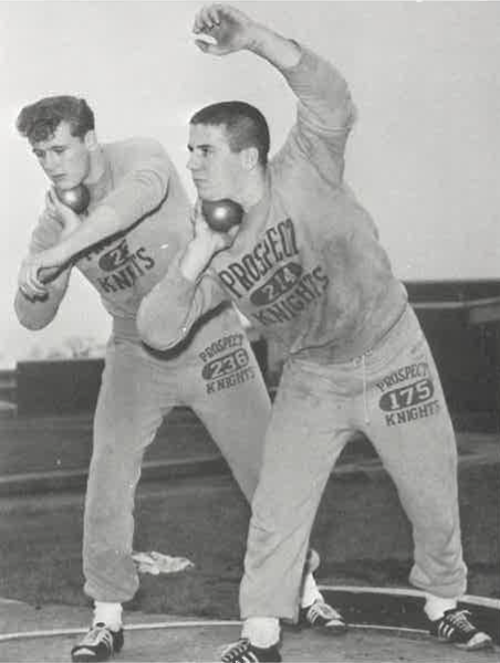
I was not expecting the full sweatsuit for this one, but I kinda like it. I definitely give it points for comfort but these may just be the warmups. For now, I will evaluate it as a jersey since this is what the article is all about. I like that the middle says 214 which I assume is referencing district 214 which I think is a cool touch to the uniform. I don’t love the grout fit going on but I guess it works for track and since they are doing shot put the outfit just kinda matches the vibe of throws to me. I don’t have a ton to say about this because it’s really just a sweatshirt and sweatpants but it looks pretty breathable and I like it for the time period.
Boys track 2023

I like this jersey a lot. It looks cool with the navy and the pattern of the dots. It’s kind of ombre which I like and it’s just different from a lot of track jerseys I’ve seen so it’s refreshing to see something new. The fit looks a little looser but for boys track I think this might be more of the style. I like how Prospect is in the middle and bold and clear to read but I think it would be cool to add a knight symbol somewhere on this jersey since it is a bit plain aside from the pattern. I like how the Columbia in the word Prospect contrasts the navy of the rest of the Jersey and I think this unfrock is a sleek cool design that I hope Prospect keeps for the future.
Basketball 2003
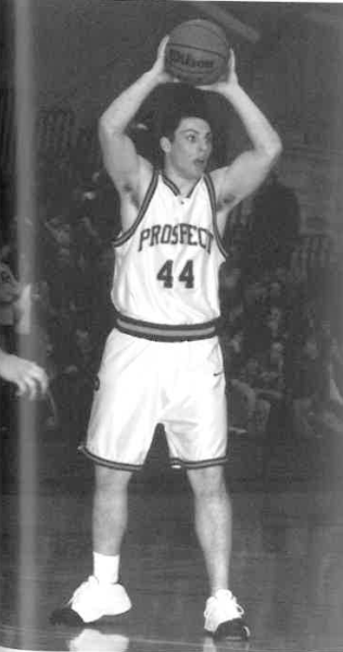
As soon as we spotted this picture we knew we had to give a tribute to the great Adam Sandler as he wears very similar things to this. The early 2000s were quite the time for shorts lengths and we can definitely tell by these. Adam Sandler! What are you doing here?
Sarah’s Overall top 5 ranking
1. Cheer 2023
2. Baseball 2023
3. Volleyball 1974
4.basketball 1962
5. Girls track 2023
Alyssa’s Overall top 5 ranking
1. Baseball 2023
2. Softball 2023
3. Basketball 1962
4. Cheer 2023
5. Track 2023